

- Post views
- 28,841,553

Introducing Liquid Glass
Scene breakdown
5 scenes
Make the clock feel like a physical object
Bands of color slide through the frame before the camera moves close to the translucent clock numerals. Light passes through the numbers before the phone itself is visible.
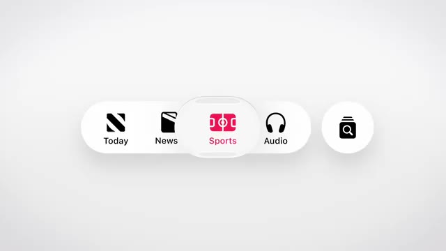
Turn the material into controls
The edit travels over glass-like letters to a small floating toolbar. Its depth and clear edges carry the same visual idea from typography into navigation.
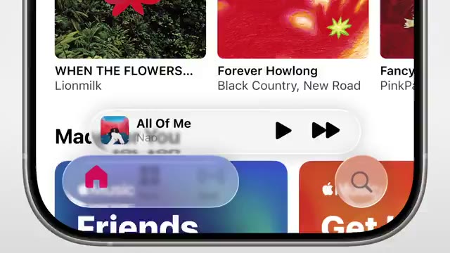
Move from the lock screen into an app
The clock returns at phone scale. A flower lock screen gives way to a media interface with translucent playback controls sitting above the content.
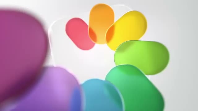
Carry the reflection across apps
A circular control, a map panel and colored icon layers appear in succession. The close crops make the material easy to follow as the interface changes.
Use the last reflection for the signature
A tight view of the Safari compass gives way to a pale field. The same iridescent finish reappears on a single Apple logo.
About the film
Tim Cook’s 42-second launch edit follows one material through Apple’s software. A transparent clock becomes a toolbar, a media control and finally a set of familiar app icons.
Use this scene in a briefFilm details
- Published
- June 9, 2025
- Running time
- 0:42
- Format
- Launch film
- Industry
- Design software
Sound
- Music
- Track Music supports the reveal while the pictures carry the explanation. The sequence relies on continuous gliding motion through buttons, letters and icons.


